When you open an on-screen measuring tool, a fundamental question immediately arises: Is 1 centimeter on my monitor or smartphone glass actually 1 centimeter in real life? The answer depends entirely on screen calibration. Without proper adjustments, a digital line representing 10 cm can easily measure 8.2 cm or 12.4 cm on different screens. Here is how true 1:1 real-scale calibration works and how you can ensure absolute measurement fidelity in seconds.
1. The Screen Pixel Dilemma: Why 100 Pixels Vary Across Displays
In digital web design, dimensions are typically defined in CSS pixels. However, a pixel is not a fixed unit of physical length like an inch or a millimeter. A standard 27-inch desktop monitor might pack approximately 109 pixels into an inch, while a 14-inch MacBook Pro packs 254 pixels per inch, and a modern smartphone packs over 460 pixels into the exact same physical space.
If a web application naively draws a 100-pixel line on an older desktop monitor, that line will physically measure nearly an inch wide (about 23 mm). If it draws that same 100-pixel line on an unadjusted high-density mobile phone screen, the line shrinks to barely 5.5 mm! This physical variance is known as the screen pixel dilemma, and it explains why generic virtual rulers fail without calibration.
2. Defining True 1:1 Real Scale on Modern Displays
In metrology and engineering drafting, 1:1 scale (often denoted as 1:1 original size or true scale) means that any distance depicted on the blueprint or medium corresponds exactly to the same distance in the physical world without magnification or reduction.
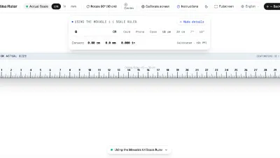
For an Online Centimeter Ruler, 1:1 original size means that if you place a physical wooden metric ruler against your computer screen, the 1 cm, 5 cm, and 10 cm marks on the glass match the graduation marks of your physical wooden ruler with zero visible discrepancy. Achieving this requires the software to calculate the exact physical millimeter width of each individual device pixel.
3. PPI, DPI, and CSS Device Pixel Ratio Explained
To understand how our ruler guarantees precision, it helps to review three key display metrics:
- Pixels Per Inch (PPI): The true physical number of hardware pixels arranged in a one-inch line on your screen panel. This is determined at the factory during display fabrication.
- Dots Per Inch (DPI): Originally a printing term, DPI is frequently used interchangeably with PPI in operating systems like Windows to describe font scaling levels (e.g. 125% or 150% display scaling).
- Device Pixel Ratio (DPR): The multiplier modern browsers use to map CSS layout coordinates to high-resolution physical retina pixels. An iPhone often has a DPR of 3.0, meaning each CSS coordinate represents a 3x3 grid of physical pixels.
Because browsers do not have access to your hardware screen diagonal size through standard web APIs (to prevent fingerprinting), a virtual ruler must either detect known device profiles or allow you to synchronize the scale with a known physical object.
4. The 10-Second Test: Verifying 1 cm on Your Screen
Want to confirm whether your screen ruler is accurate right now? Perform this simple verification:
- Open our 1:1 Online Ruler on your laptop, tablet, or phone.
- Locate a standard euro coin, US quarter, or standard credit card.
- A standard Euro 1 coin is exactly 23.25 mm (2.32 cm) in diameter; a US quarter is 24.26 mm (2.43 cm).
- Align the left edge of the coin against the zero mark on the screen. The right edge should land exactly between 23 mm and 24 mm.
- If the measurement aligns, your display is perfectly calibrated to 1:1 original size!
5. The ISO/IEC 7810 Credit Card Calibration Standard
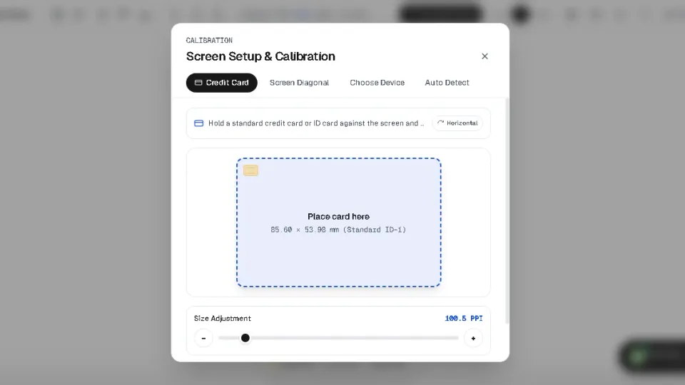
If your initial test shows a discrepancy, our calibration tool provides the gold standard of digital metrology: calibration via standard plastic payment cards.
Under international standard ISO/IEC 7810 ID-1, every bank debit card, credit card, EU driver’s license, and national identity card manufactured worldwide must adhere to rigorous dimensional tolerances:
| ISO 7810 Dimension | Metric (mm & cm) | Imperial (Inches) | Tolerance |
|---|---|---|---|
| Width (Long Edge) | 85.60 mm (8.56 cm) | 3.370 inches | ± 0.12 mm |
| Height (Short Edge) | 53.98 mm (5.40 cm) | 2.125 inches | ± 0.06 mm |
| Thickness | 0.76 mm | 0.030 inches | ± 0.08 mm |
By visiting our Calibration Page and aligning your bank card against the digital outline, the software calculates the exact mathematical ratio between physical millimeters and screen pixels. Once saved, every page—including the millimeter scale and inches scale—maintains 1:1 true scale indefinitely.
6. Measuring Beyond Screen Boundaries: 10 cm, 20 cm, and 30 cm Objects
One common challenge with screen-based measurement is that modern smartphone displays are typically 12 to 15 centimeters tall. If you need to measure an envelope, a book, or a mechanical rod that is 20 cm or 30 cm long, a static ruler will run out of screen space.
Our Scrollable Scale Tool solves this constraint. It provides a movable 30-centimeter ruler that you can drag left and right across your screen using touch or mouse gestures. You can align the first 10 cm against your object, note the boundary, drag the ruler forward, and continue measuring without losing your calibrated baseline.
7. Common Pitfalls and Achieving Sub-Millimeter Precision
To achieve reliable metrological accuracy down to 0.1 mm, avoid these three frequent mistakes:
- Browser Zoom Drift: If you accidentally pinch-to-zoom on mobile or press Ctrl/Cmd and plus on desktop, the digital ruler expands. Always double-check that your browser zoom is at 100%.
- Case Bump Obstructions: Bulky smartphone cases with thick raised lips elevate the object away from the screen glass, exaggerating parallax. Either remove the protective case for delicate measurements or lay the object across the flat portion of the screen.
- Curved Display Edges: On smartphones with waterfall or curved edge screens (such as older Samsung Galaxy Edge models), avoid placing objects on the extreme curved glass sides where optical refraction distorts linear marks.