When you open an "actual size ruler" on the web, can you really trust the marks? The answer is nuanced: yes, a web-based ruler can achieve sub-millimeter precision, but only if it accounts for the physical hardware properties of your display.
Why Uncalibrated Screen Rulers Are Inaccurate
The World Wide Web Consortium (W3C) defined 1 CSS inch as exactly 96 CSS pixels in 1996. While this was reasonable for bulky CRT monitors of the 1990s, today's hardware is completely different:
- A 24-inch 1080p monitor has about 92 PPI (close to 96).
- A 27-inch 4K monitor has about 163 PPI.
- A 14-inch MacBook Pro Retina display has 254 PPI.
- An iPhone 15 Pro OLED screen has 460 PPI.
If a website simply renders 96px as "1 inch", an inch will look wildly too small on an iPhone or too large on a low-density television display.
Understanding CSS Pixels vs Physical Pixels
Modern operating systems use a Device Pixel Ratio (DPR) scaling factor (often 1.25x, 1.5x, 2x, or 3x) to make text sharp and readable. While this makes websites beautiful, it abstracts physical measurement away from the web browser. The browser literally does not know how many centimeters wide your physical monitor bezel is!
How Calibration Solves the Scale Problem
To achieve true 1:1 scale, our software employs two smart approaches:
- Automatic Device Detection: We inspect your device User-Agent, viewport width, screen height, and DPR against a database of over 100 popular phone and tablet models (iPhones, iPads, Galaxy devices) to pre-calculate exact PPI.
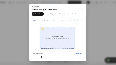
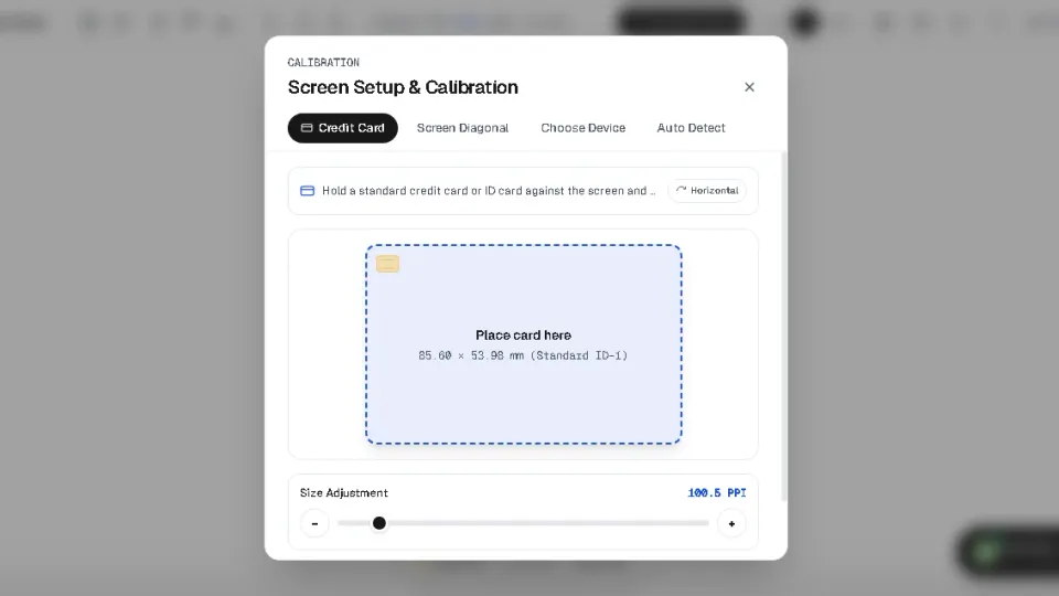
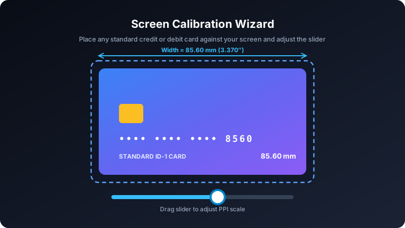
- Reference Object Calibration: By placing a standardized everyday object (like a credit card) against the screen and sliding an interactive handle until the box matches the card, the math solves for the exact millimeter-per-pixel ratio.
Step-by-Step Guide to Calibrating Your Screen
Step 1: Check Browser Zoom
Press Ctrl + 0 (Windows) or Cmd + 0 (Mac) to ensure browser zoom is at 100%.
Step 2: Open the Calibration Wizard
Navigate to our dedicated Screen Calibration Tool or tap the "Calibrate" button in the toolbar.
Step 3: Align Your Reference Card
Hold any bank card against your screen and adjust the slider until the outline matches your card's outer edges exactly. Your settings are instantly saved in your local storage.